


Preview
Creation Date
2019-04-26
Description
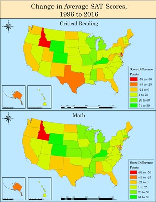
Diana Gerberich created this map depicting the change in average SAT scores between 1996 and 2016 of high school seniors attending college in Geo 441: Geographic Information Systems for Community Development during Winter Quarter of 2019. The top map represents SAT scores in critical reading and the bottom map represents SAT scores in math. The data was collected from the National Center for Education Statistics. Both choropleth maps are categorized in 25 point intervals with negative values (orange to red) indicating a decrease in average SAT scores and positive values (yellow to green) indicating an increase in average SAT scores. The maps indicate certain states as areas of concern with relatively high decreases in both critical reading and math, such as Idaho. The maps also show that more than half of the states have improved their SAT scores. There seems to be a general trend that the increase or decrease in a state’s average score is consistent across both test subjects. For example, Texas’s average scores have decreased in both critical reading and math. The advantage of representing the test categories separately is that not only can this help identify states where students are underperforming, but it can also help target the subject that students are underperforming in. In the case of West Virginia, the scores have increased in math but decreased in critical reading. Maps like Diana’s can help educators identify and address areas of academic improvement and intervention.
Keywords
Education, SAT, GIS, USA, States, Statistics, Math, Reading