


Preview
Creation Date
2017-11-05
Description
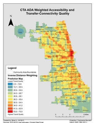
This map was made in GEO 300: Geographical Inquiry in Fall 2017 by Brian Li as part of his senior capstone project. Brian's work won First Place in the Undergraduate Student Poster Competition at the 2017 East Lakes American Association of Geographers conference, held at Eastern Michigan University in October 2017. This map, one of several developed for Brian's larger project, shows the CTA's transit quality based on ADA accessibility and transfer-connectivity. For this project, Brian devised a "weighted transit quality index" that measured ADA accessibility, the number of CTA stations within a quarter-mile buffer of each CTA station, and the number of possible transfers to other bus routes or train lines at the same station (referred to in the index as 'connections' for each CTA bus and train station). In the index, all CTA bus stations and bus stops were defined as ADA accessible due to the nature of the bus having operable ramps. Only some CTA train stations, however, are ADA accessible. To emphasize ADA accessibility, a weighting technique was incorporated into the index to strongly accentuate that aspect in the final map. The resulting "transit quality score" is a composite of the ADA score, number of stations within a quarter-mile, and the number of connections for each station. The colors in the legend display the "transit quality index" with blue signifying the lowest quality and red signifying the highest quality. In the fuller project, this weighted index was analyzed in relation to census tract population data of people over 65 years old and an ambulatory disability map of Chicago to see how the CTA transit quality and ADA accessibility related to those factors.
Keywords
ada, accessibility, CTA, transit, transportation, disability, Chicago